Shy!
An App Revolutionizing Introverts' social Connections.
Background
"Shy" was conceived by an introverted entrepreneur who recognized the challenges introverts face when venturing into new hobbies or social interactions. The app aimed to bridge this gap by facilitating connections among introverts sharing similar interests.
To discern the comfort levels of introverts in approaching new people with similar interests and determining the optimal group size for initial interactions.
Tools
Figma
Illustrator
Miro
Team
1 UX Designer
My Role
UX Deign
UX research
Workshop facilitator
Timeline
Overall: 8+ weeks
Discovery & Research: 2+ weeks
Design & testing: 6 weeks
SURVEYS
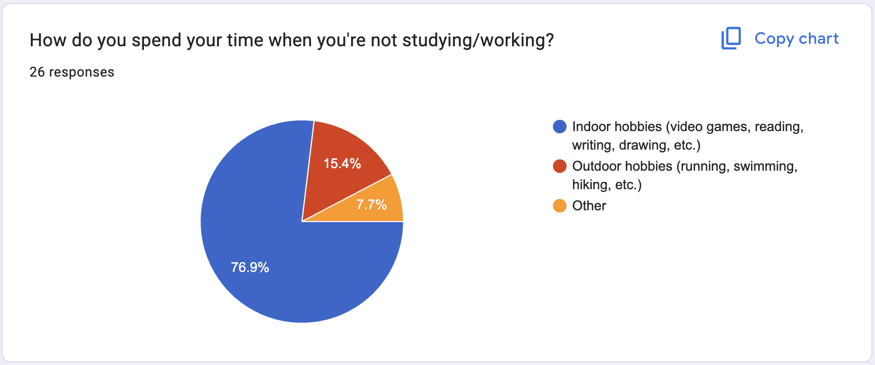
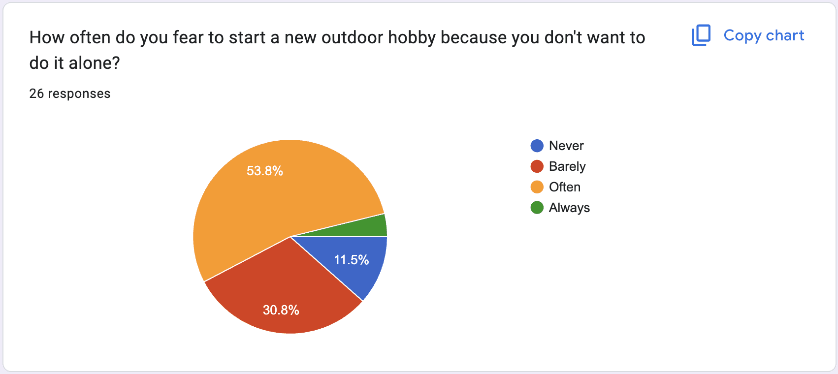
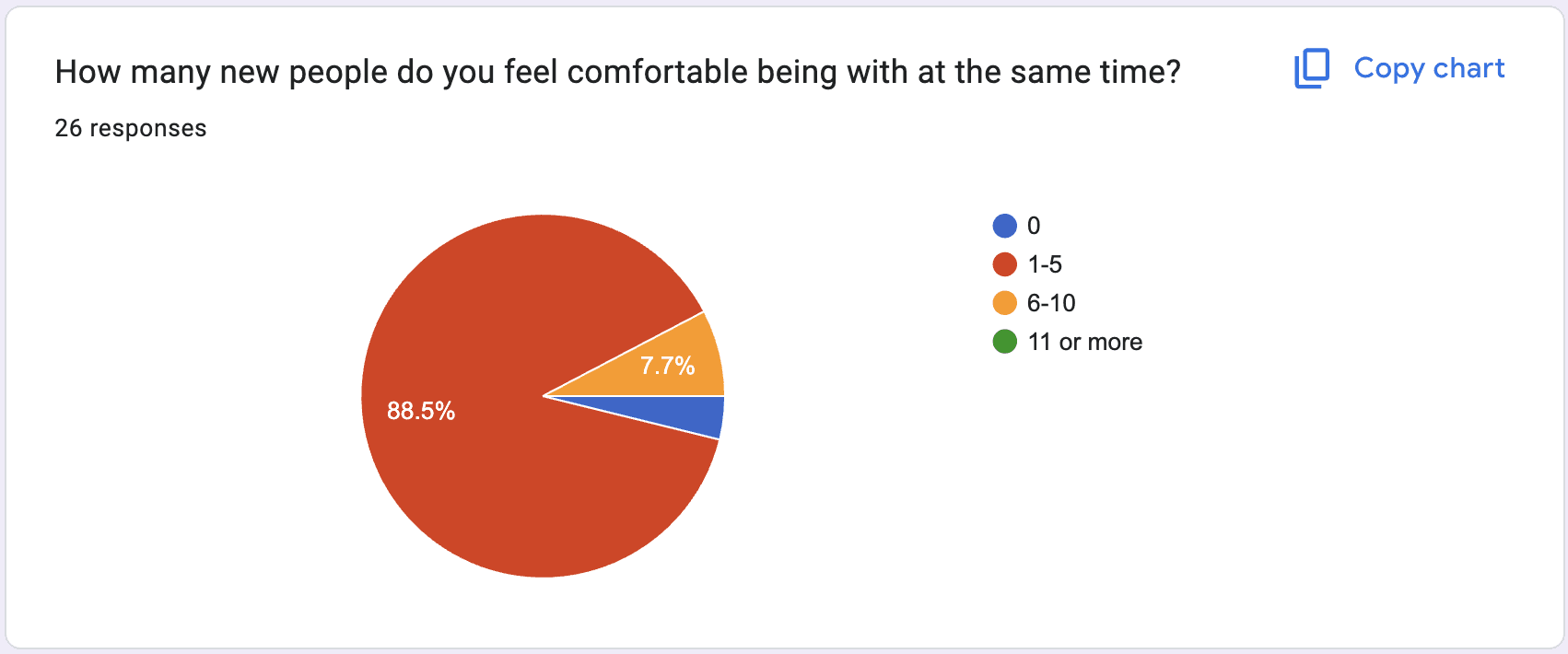
Initially, we created an online survey and disseminated it across pertinent communities. Within a brief span of a few days, we garnered 28 submissions.
28 People responded
Multiple choice surveys were conducted
28
RESPONSES
4
FUNDAMENTAL PATTERNS
8
USABILITY TEST PARTICIPANTS
1
MAJOR REDESIGN
Interviews:
5 representatives from the survey for interviews talking about being introverted and social media, meeting people and hobbies.
Key Findings:
- 50% prefer online meetups.
- Over 75% favor indoor hobbies.
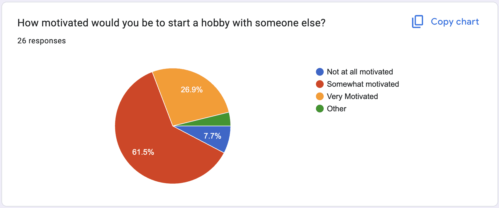
- Over 80% hesitate to start hobbies alone.
- Nearly 90% prefer groups of no more than 5 for comfort.
- Over 60% would start a new hobby if initiated by new acquaintances.
- Awkwardness makes it difficult to get to know new people, hobbies make it easier.
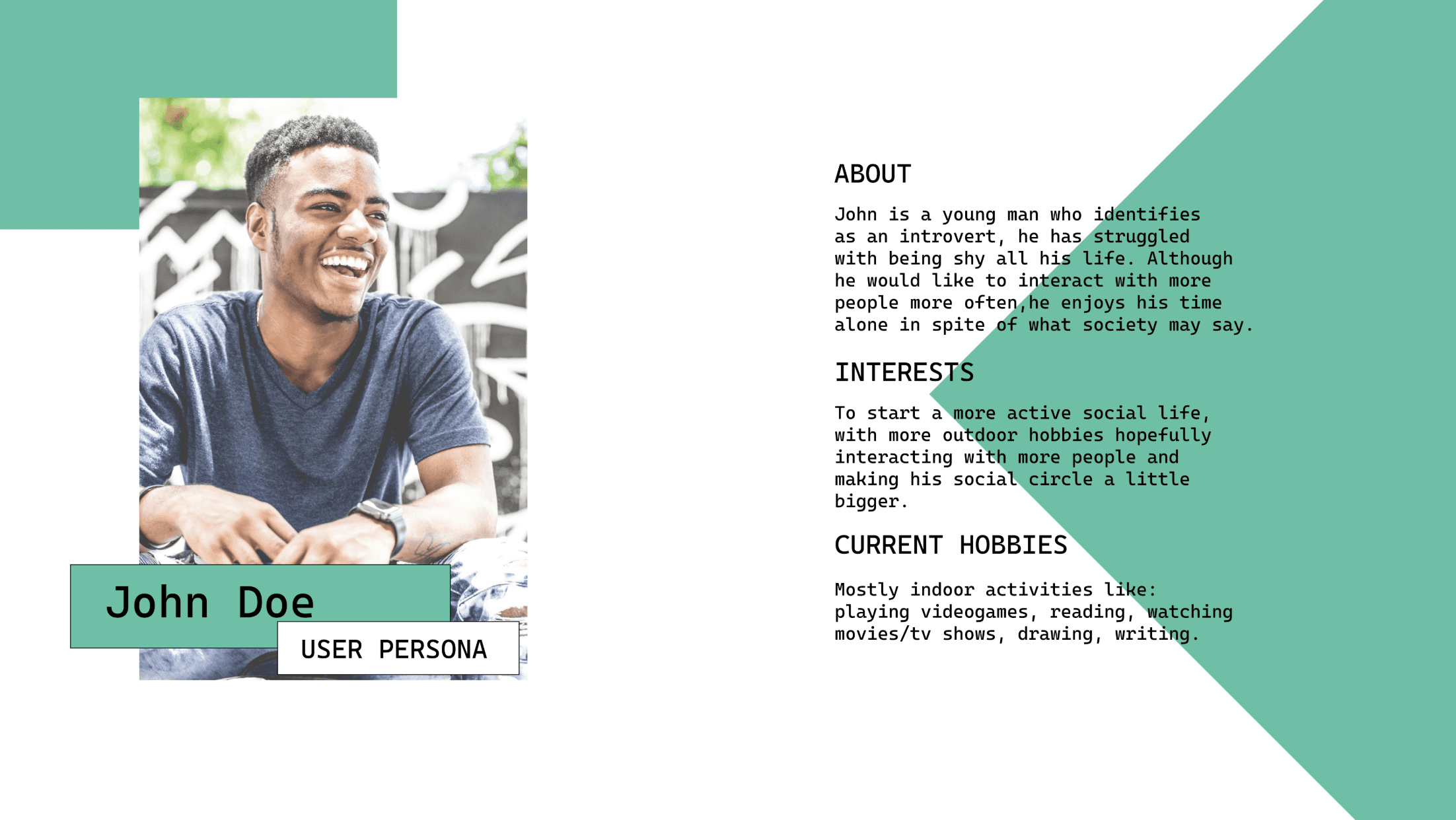
Personas:
Using the survey data of participants, as well as potential product users, I distilled the four most prominent patterns identified in the research to construct this persona. In this instance, the individual is inclined towards indoor hobbies, harbors reservations about initiating solo outdoor activities, experiences discomfort when interacting with more than five new people simultaneously, and exhibits receptiveness to the prospect of commencing a new hobby if undertaken with a companion.
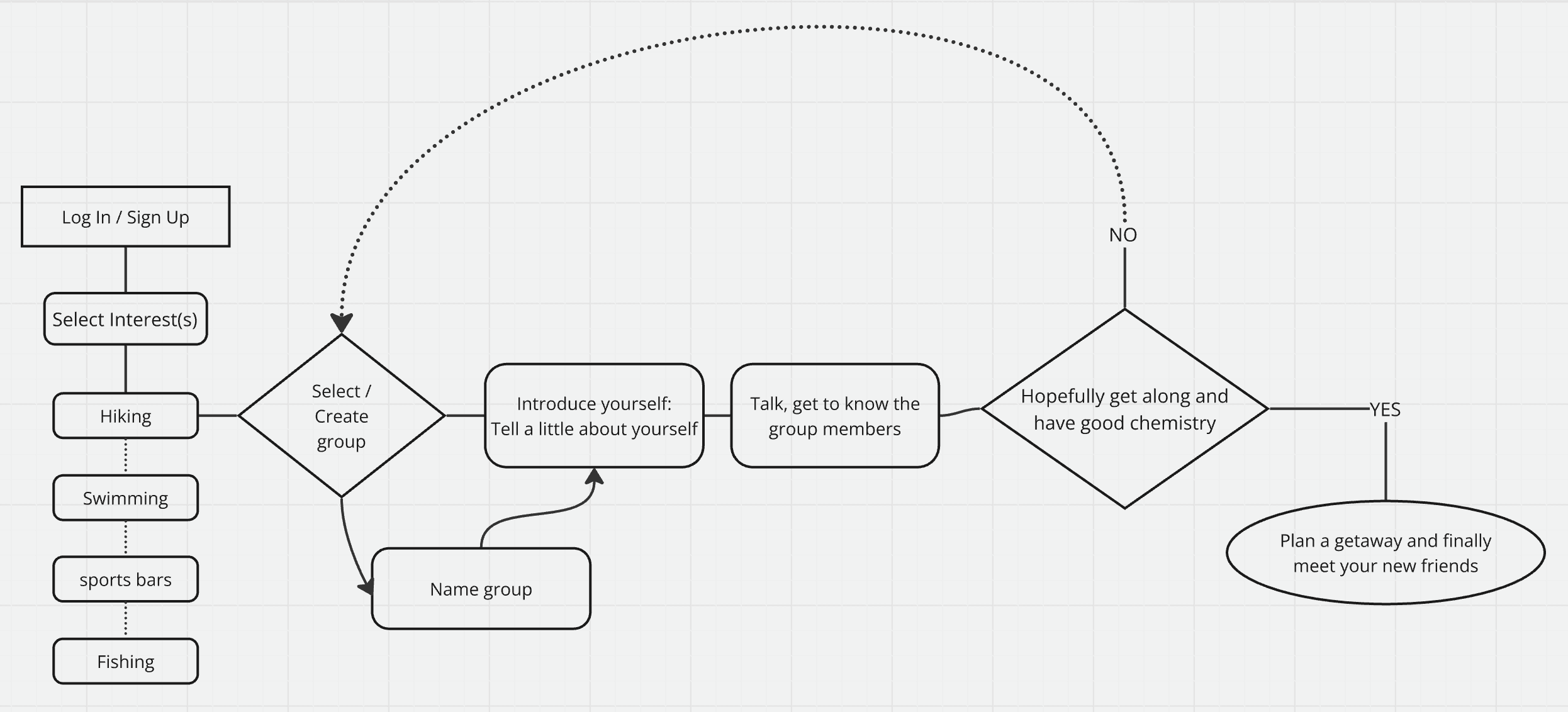
User Flow:
Using the survey data and key patterns identified, I crafted a comprehensive flow map designed to seamlessly guide users through the process of creating or joining a new social group centered around diverse interests. In the event of a successful progression, the transition into familiarizing oneself with new friends is facilitated smoothly. Conversely, if challenges arise, the transition into either joining a different group or creating one is equally streamlined and user-friendly.
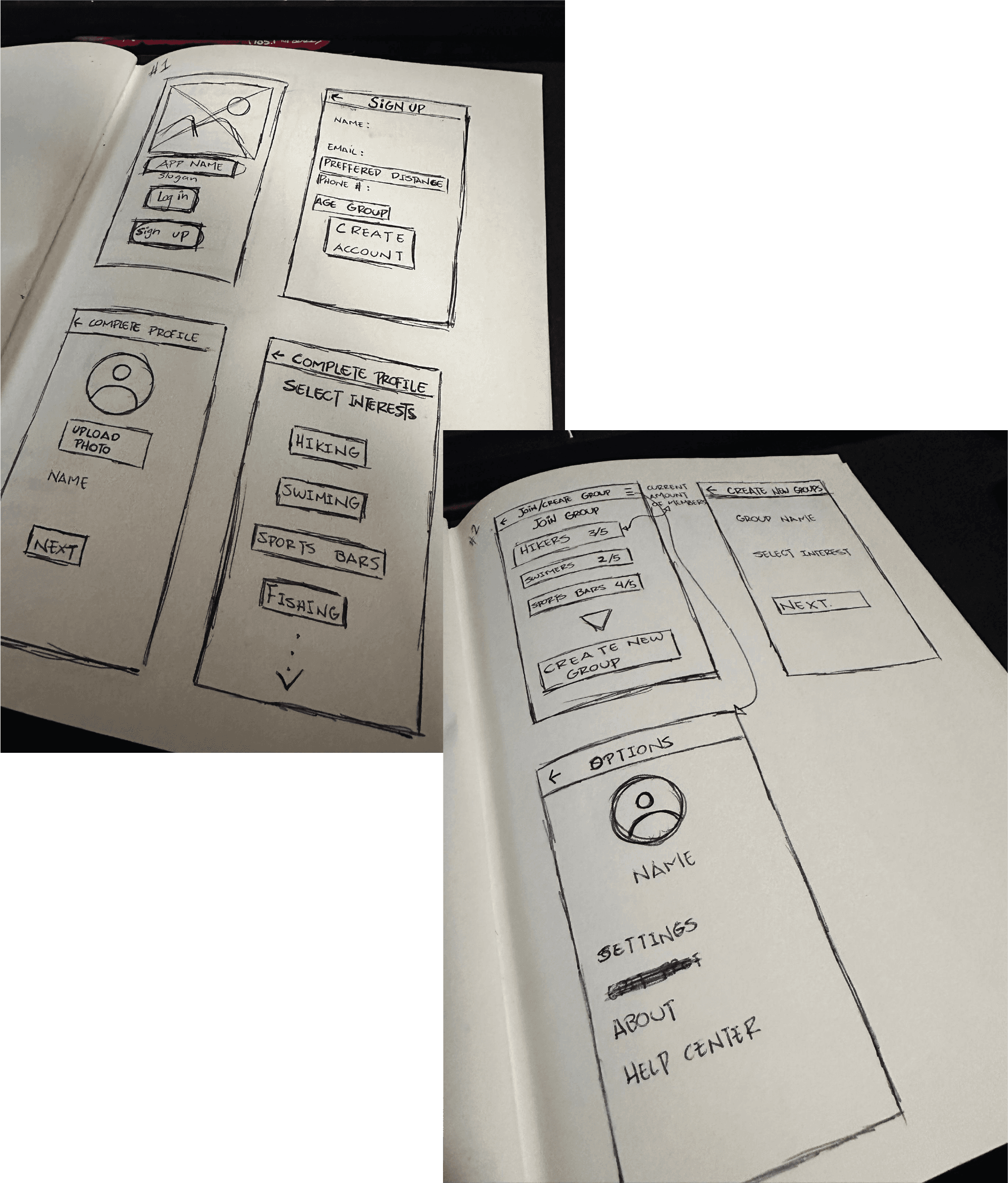
Sketches:
I began the design process with low-fidelity sketches and wireframes to accelerate decision-making through visualization without losing time. My sketches were based on the initial user interviews, the business goal, and the heuristic evaluation. They each pointed to the fact that there were too many distractions in the flow. We came back to the sketches throughout the entire design process to make sure that we don’t lose sight of our primary goals and ideas.
Wireframes:
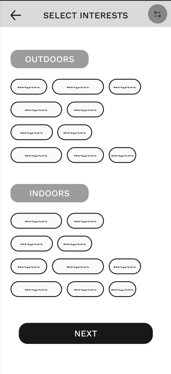
Utilizing Figma, I translated my initial sketches into low-fidelity wireframes. These wireframes reached a level of definition suitable for preliminary user testing at this stage.
UI Design:
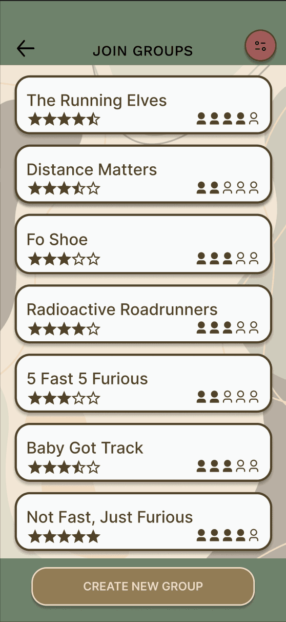
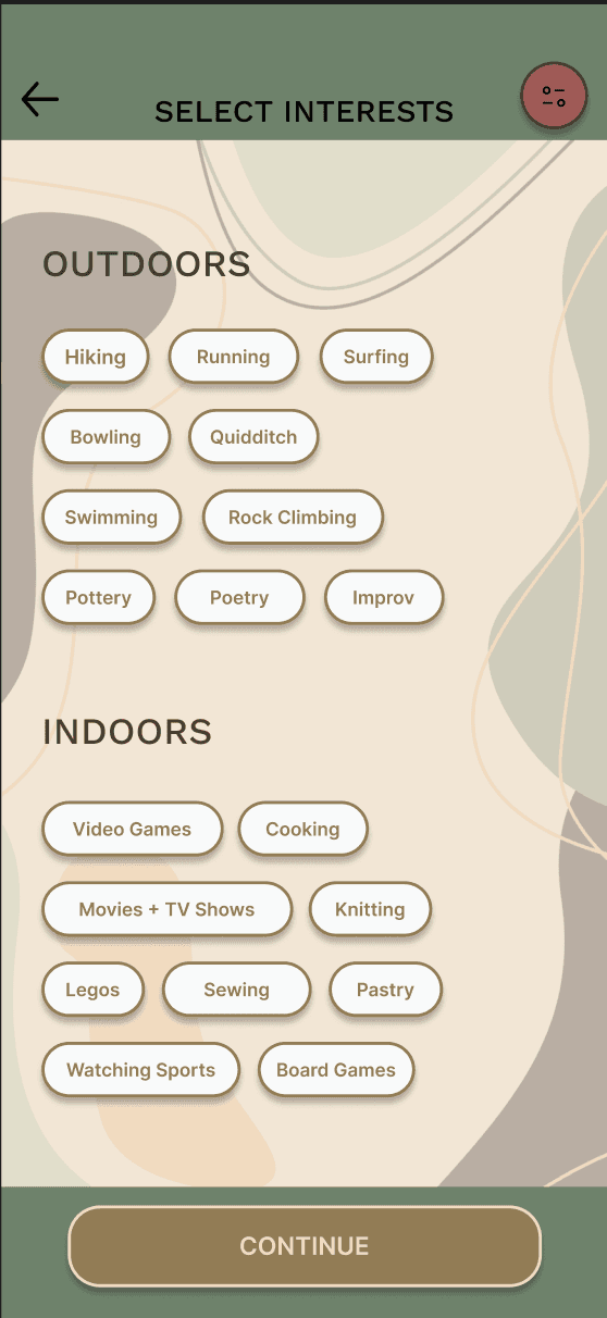
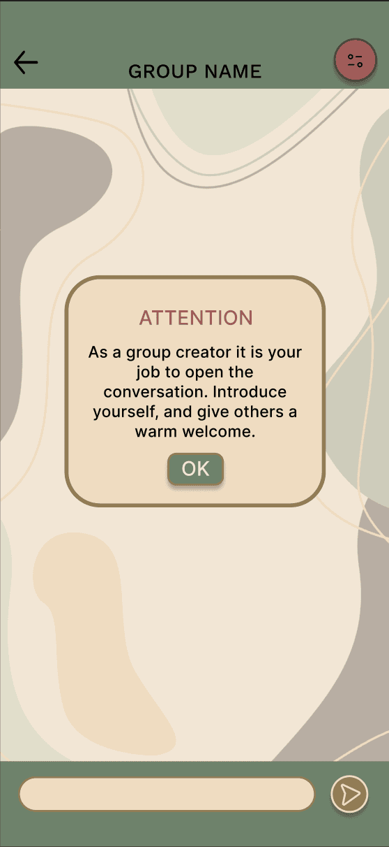
Once the usability issues were resolved, I proceeded to design the final screens in Figma. My objective was to craft a visual identity that exuded a calm, warm, and welcoming essence for the user, all while maintaining simplicity based on the research findings. Key to ensuring the seamless functionality of all screens was the effective use of components. In addition to a star-based rating for each group, a simple yet crucial indicator was incorporated to swiftly communicate the number of members in each group.
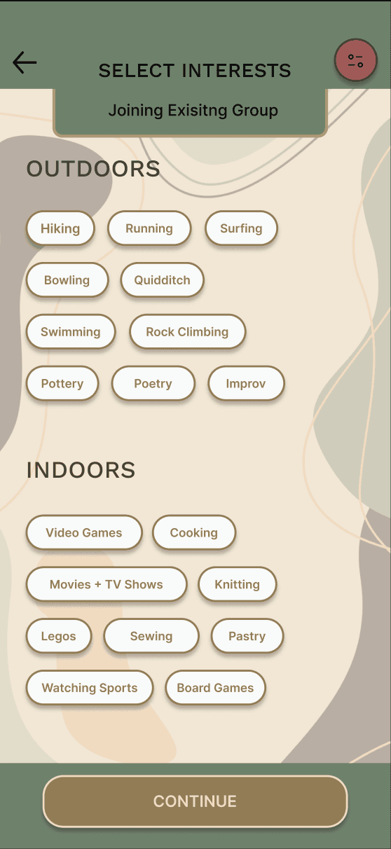
1 Major Flaw:
While the initial phases of the app design process appeared to progress seamlessly, a hiccup arose during the execution of usability tests involving eight participants. The consensus among the majority was that the "select interests" screen posed confusion. This confusion stemmed from its appearance at two distinct junctures in the user's journey, with apparent difficulty in distinguishing the current path. To ensure the app functions as intended, a solution was imperative to address the clarity regarding the user's position in the journey.
Redesign:
While the initial phases of the app design process appeared to progress seamlessly, a hiccup arose during the execution of usability tests involving eight participants. The consensus among the majority was that the "select interests" screen posed confusion. This confusion stemmed from its appearance at two distinct junctures in the user's journey, with apparent difficulty in distinguishing the current path. To ensure the app functions as intended, a solution was imperative to address the clarity regarding the user's position in the journey.

Learnings:
This project has proven to be significantly advantageous for my career as a UX designer. Not only did it afford me the opportunity to bring to fruition an idea that had been percolating for several years, but it also allowed me to hone my proficiency with essential tools. Having navigated this entire journey, I am now enthusiastic about joining a team where I can leverage tools such as Adobe XD, Figma, Miro, Google Analytics, and others.
Thank You For Reading My Case Study!
I know I'd be the perfect fit for your project! My work will speak for myself.